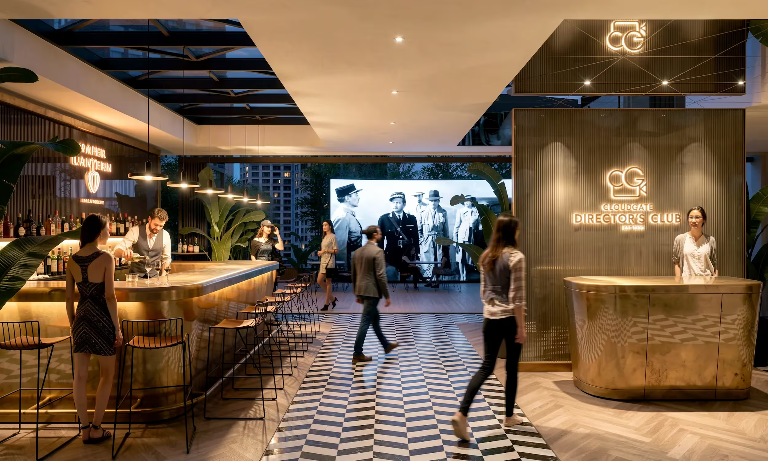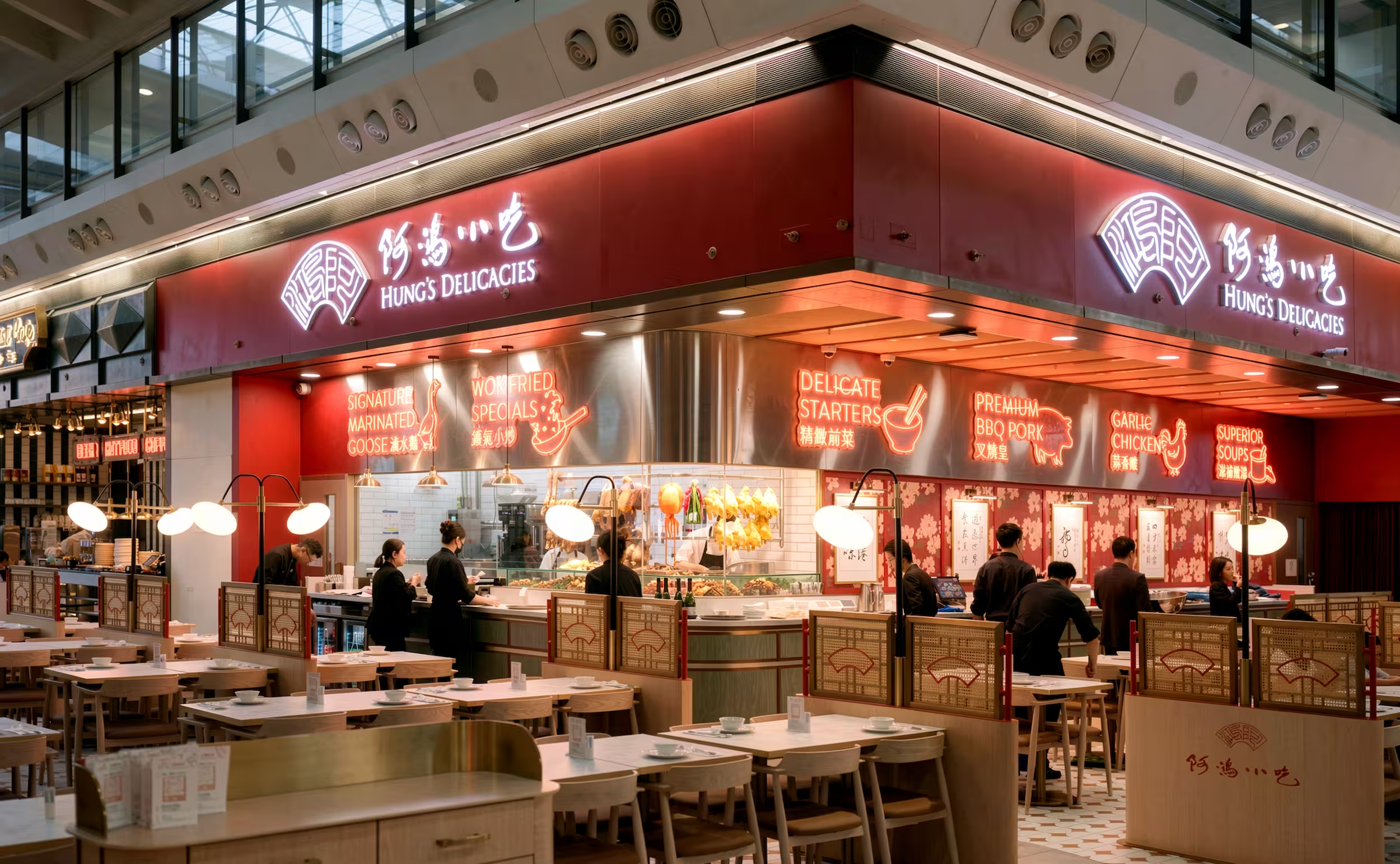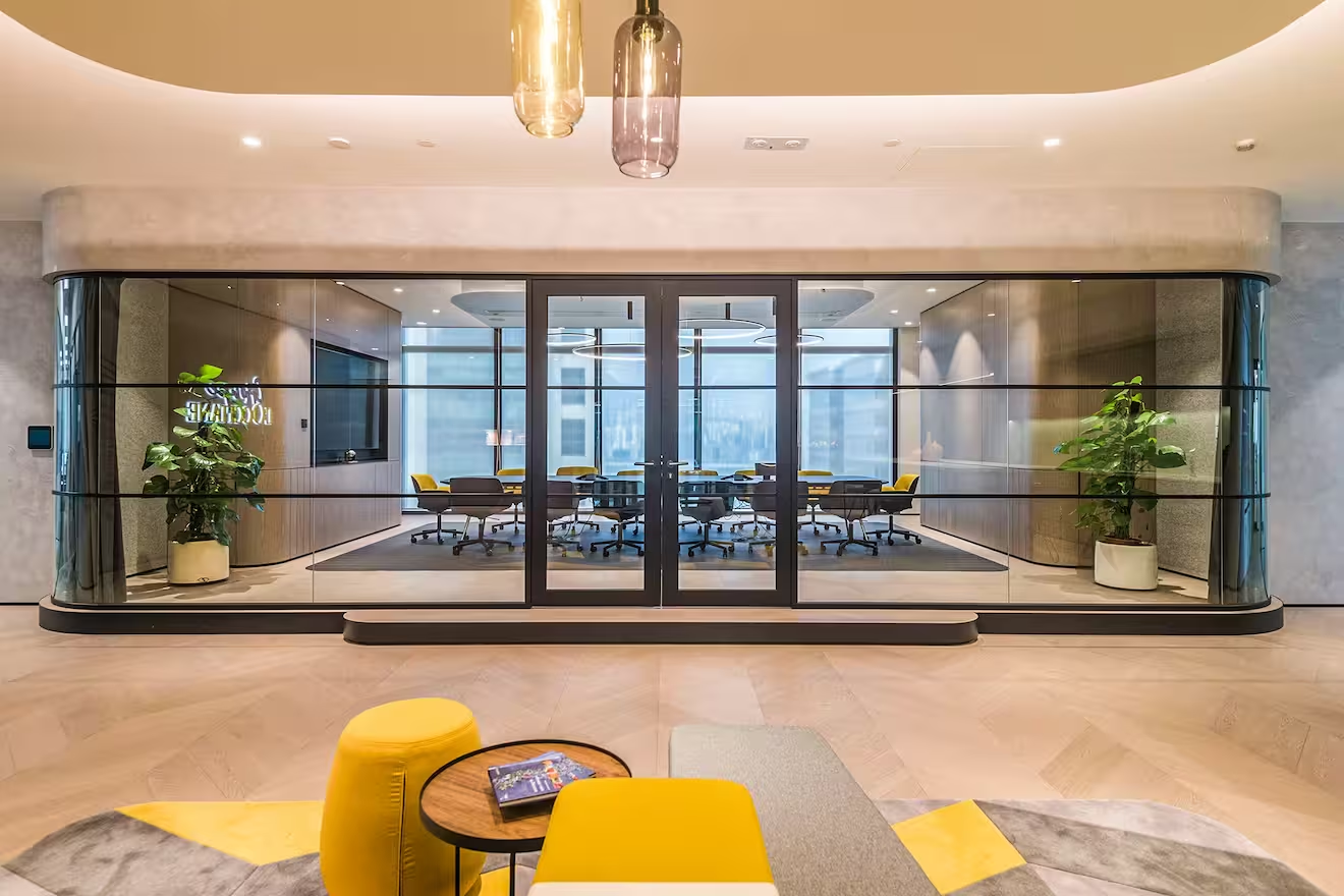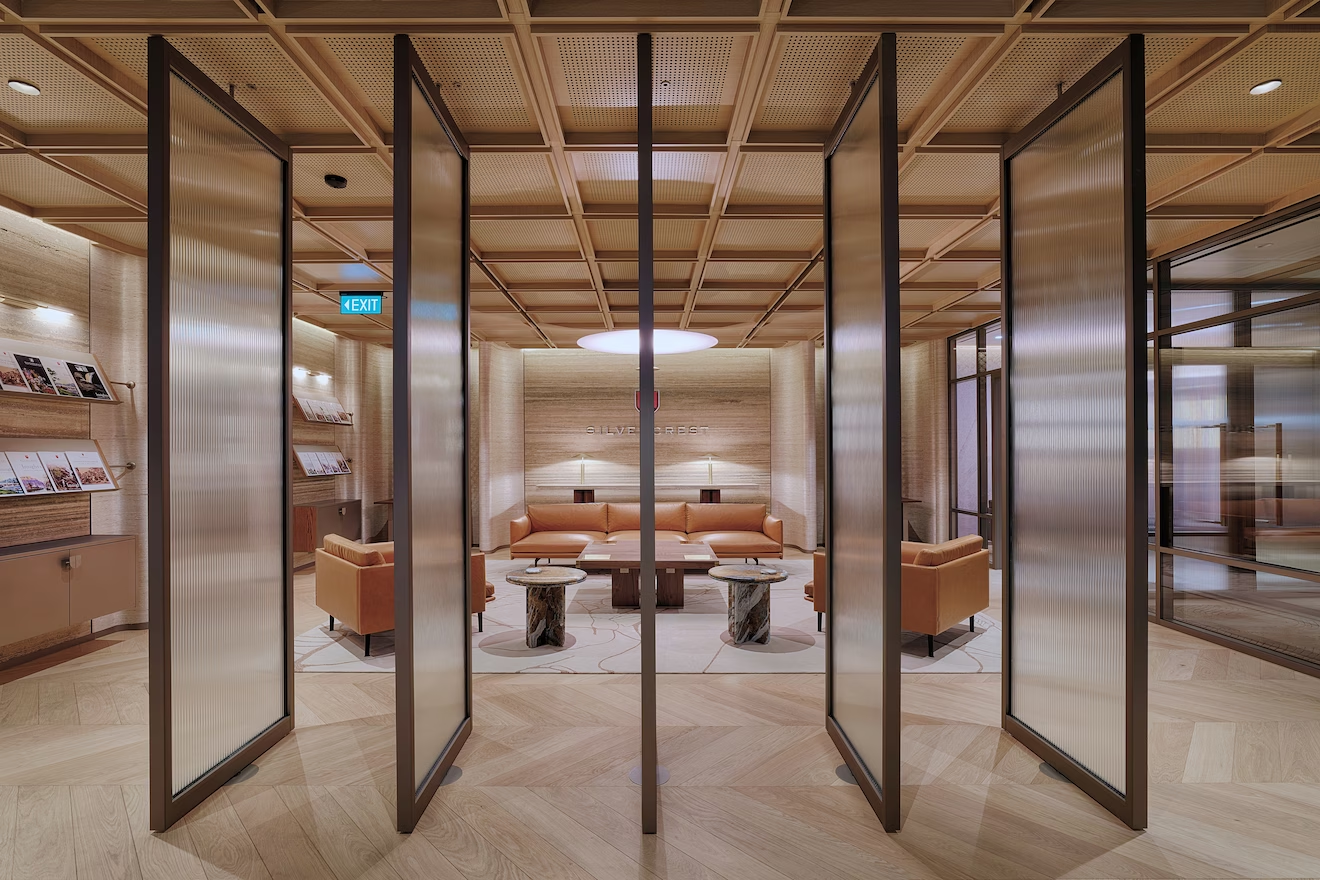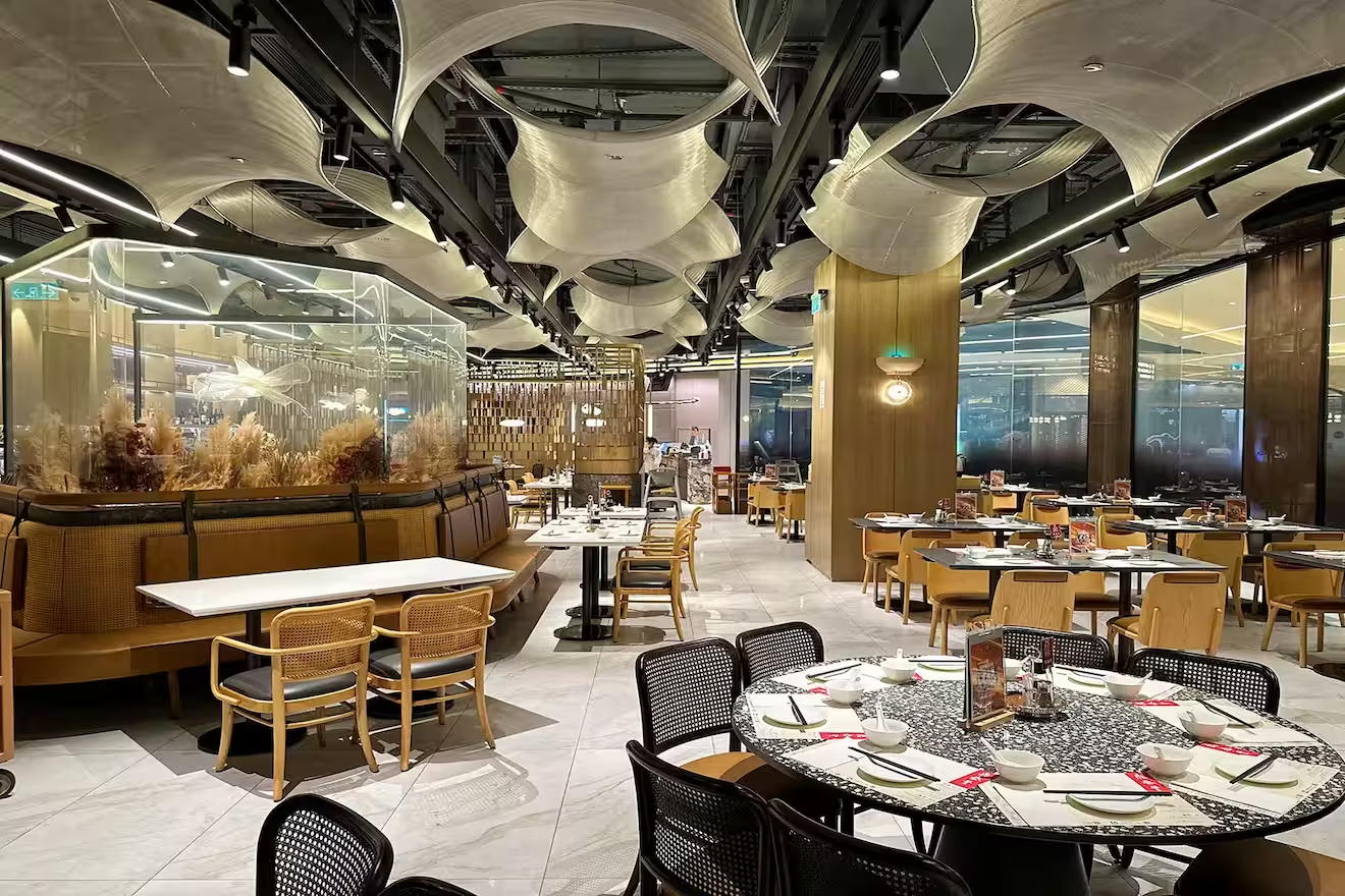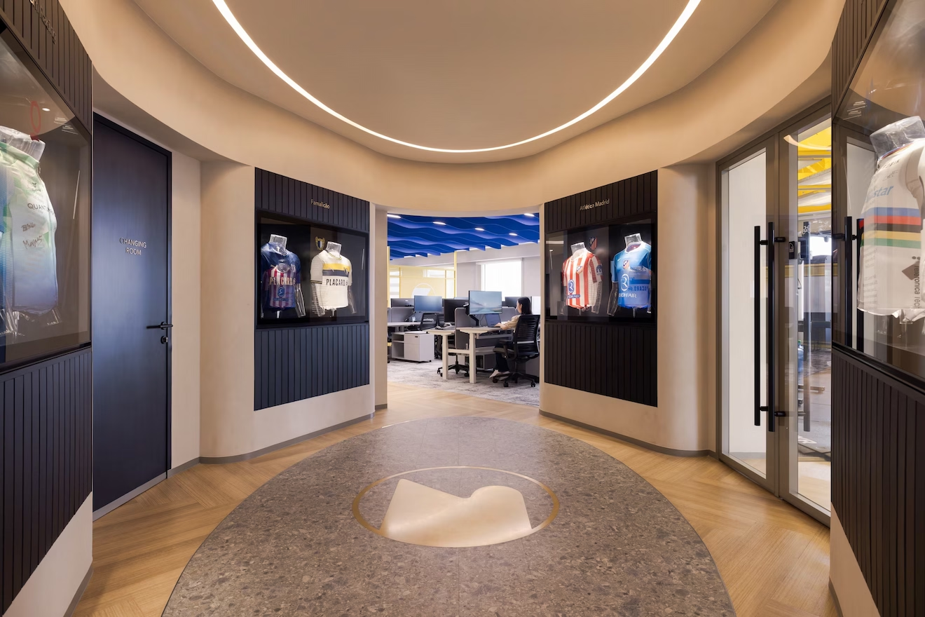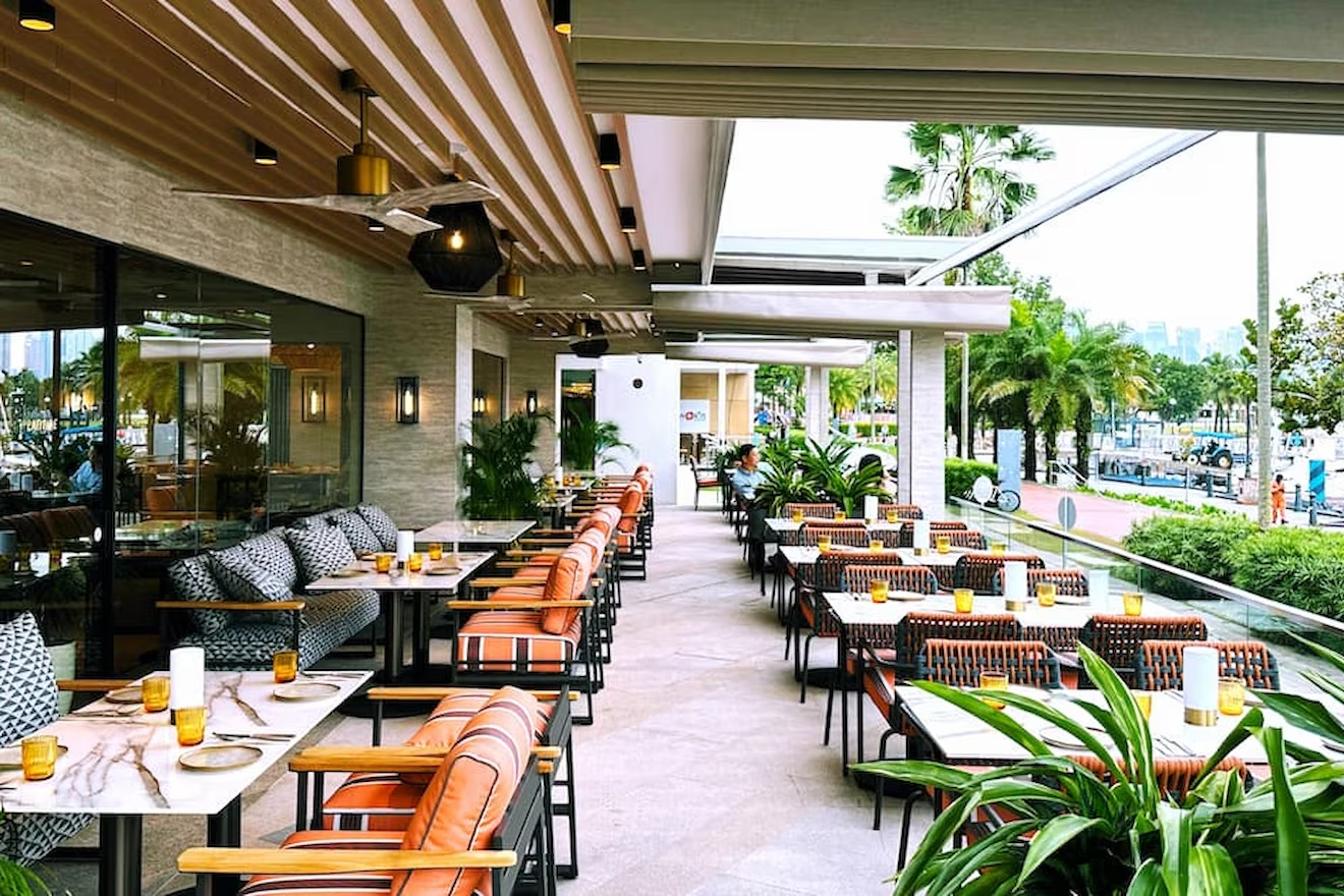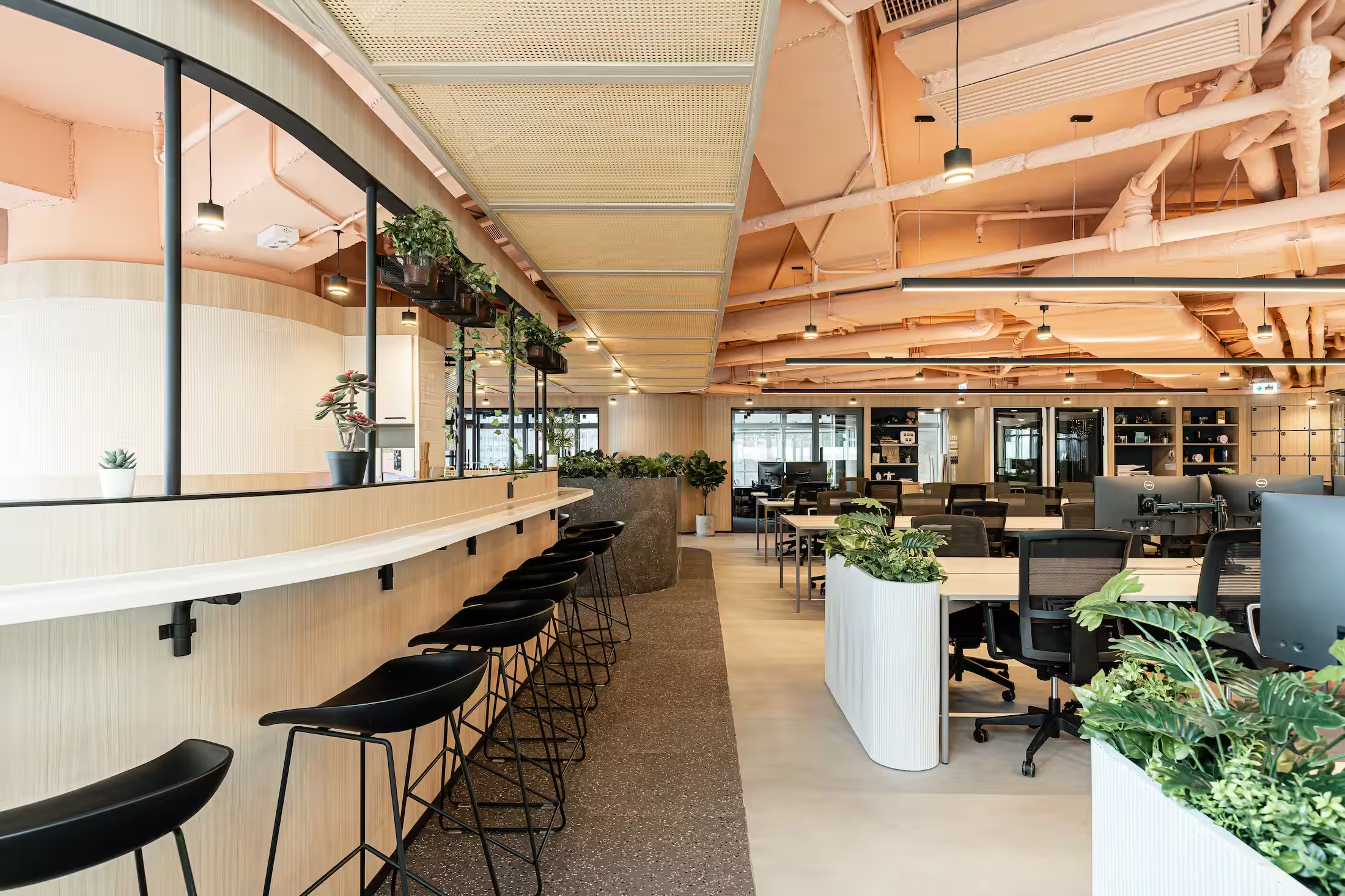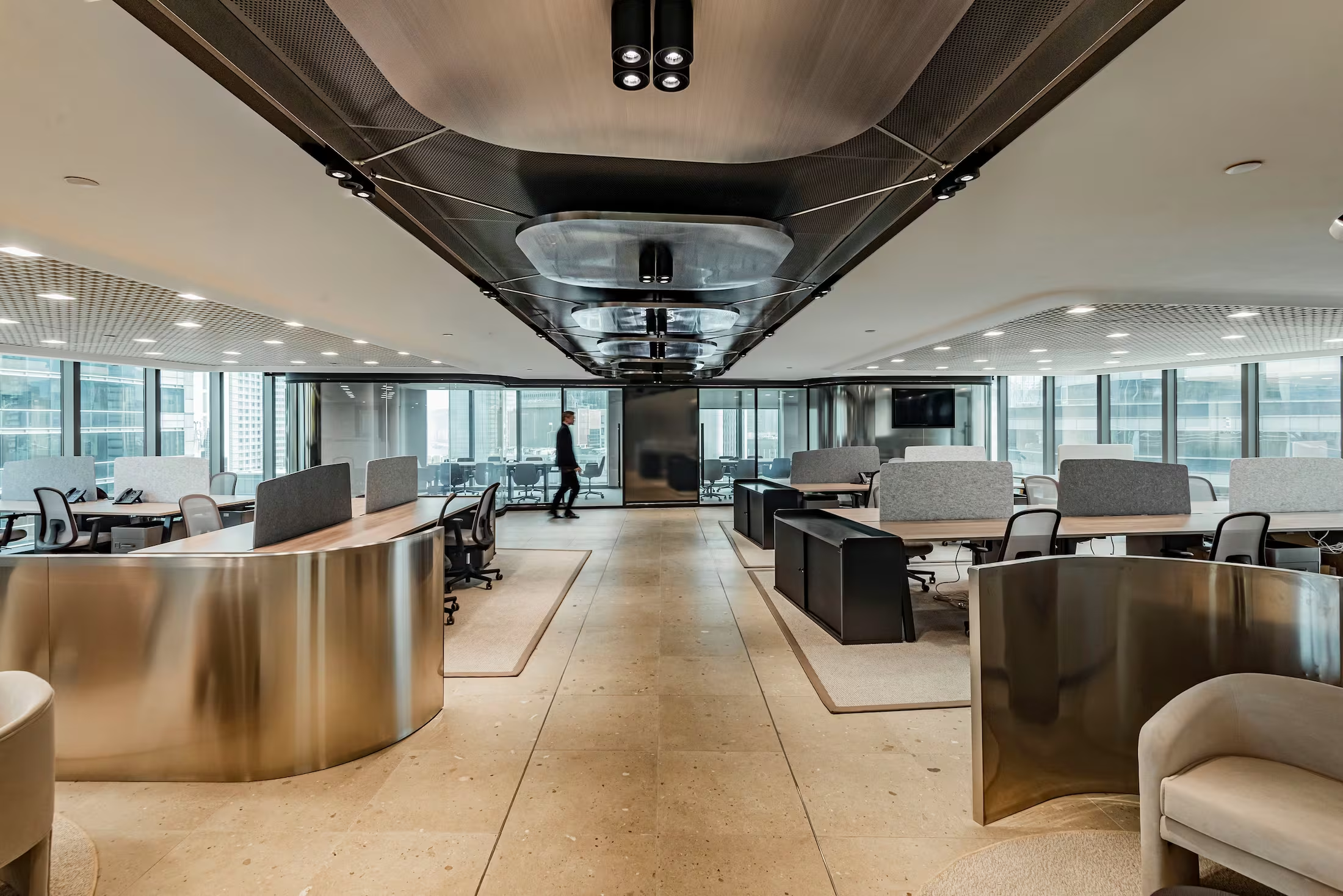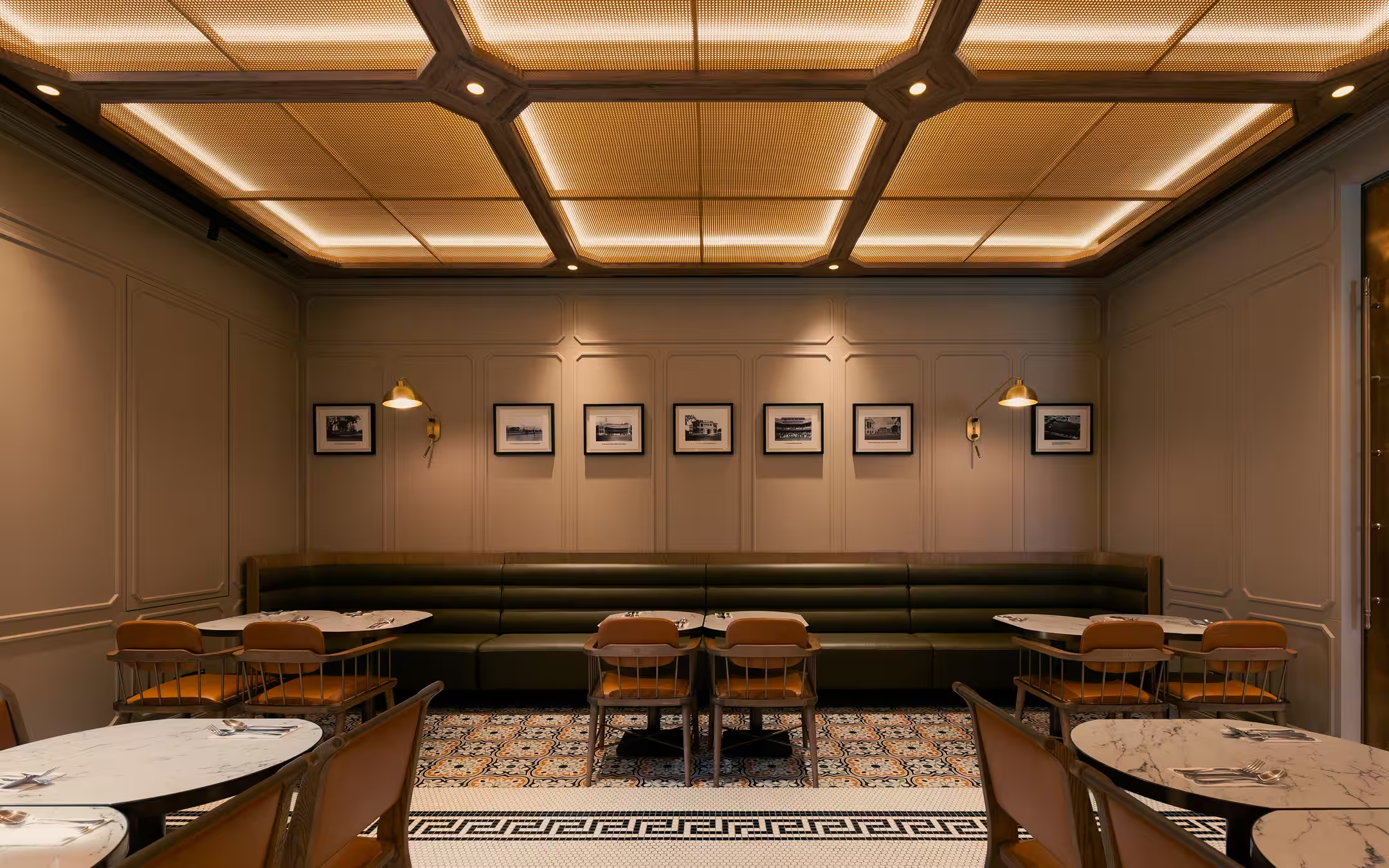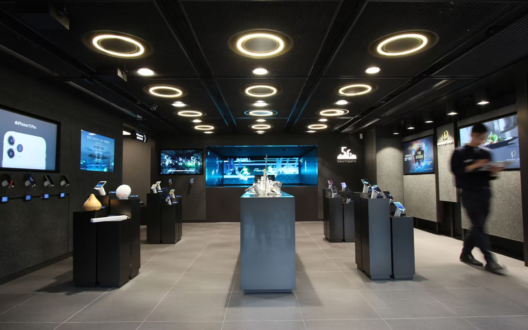
Cohesion - a co-working name, brand and spatial system designed for rollout across more than 20 sites in China.
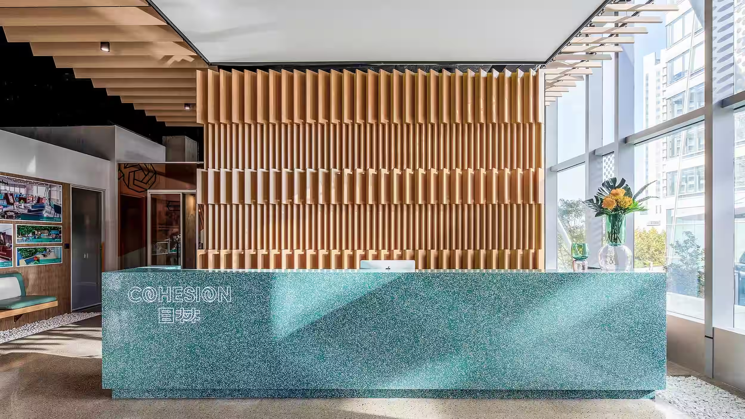
Studio X created the Cohesion co-working brand from scratch for a China-based operator, developing the naming, identity and signage system for a rollout across a growing network of sites.
Process
Pre-Concept
Concept Design
Schematic Design
Detail Design
Tender Documentation
Tender Management
Construction Support
Guideline Package
Post-Completion Review
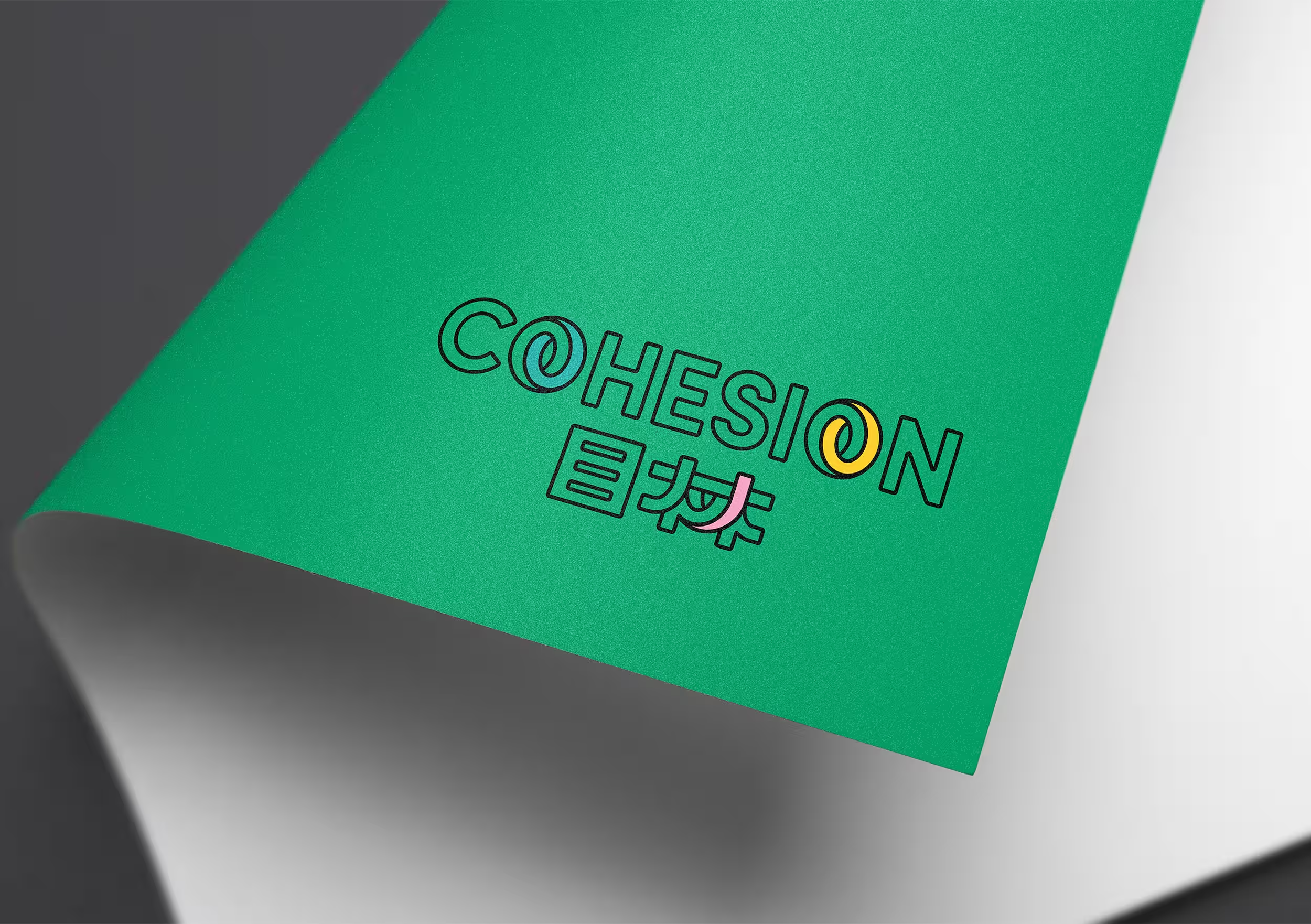
Studio X developed the naming in both English and Chinese - Cohesion in English, 目林 (Mù lín) in Chinese, built from 'Mù', meaning eye, a metaphor for vision and perspective, and 'lín', meaning a densely populated forest, a fresh and vibrant place.
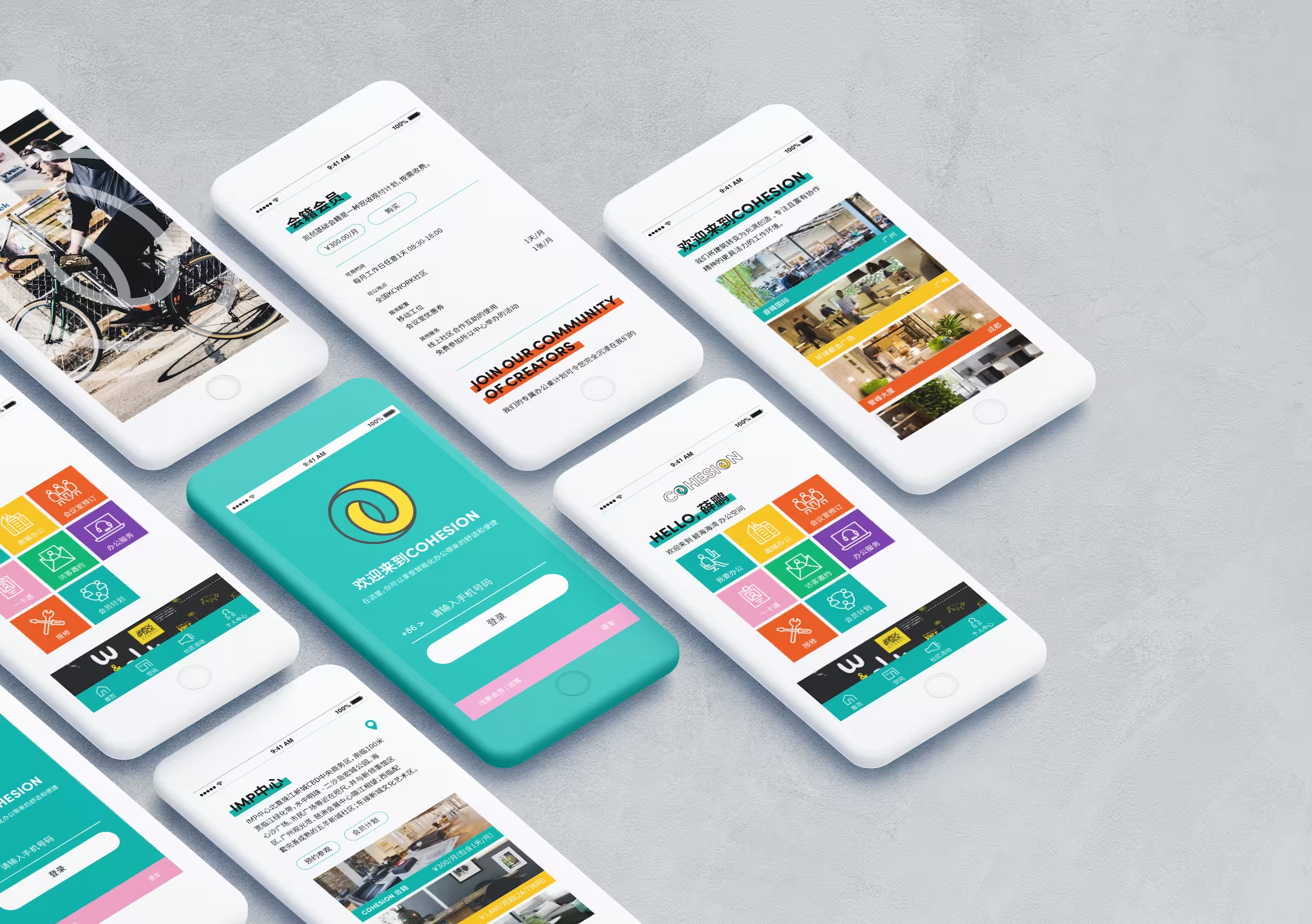
The concept and logo design are rooted in a philosophy of building a home with a heart and creating an aspirational future, advocating a higher quality of life. Beyond the identity itself, Studio X designed the desktop and mobile websites, with online booking, membership purchasing and VIP services built in, and developed the signage and wayfinding strategy and design carried through every site in the network.
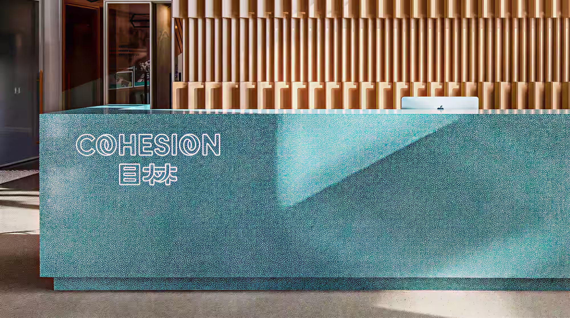
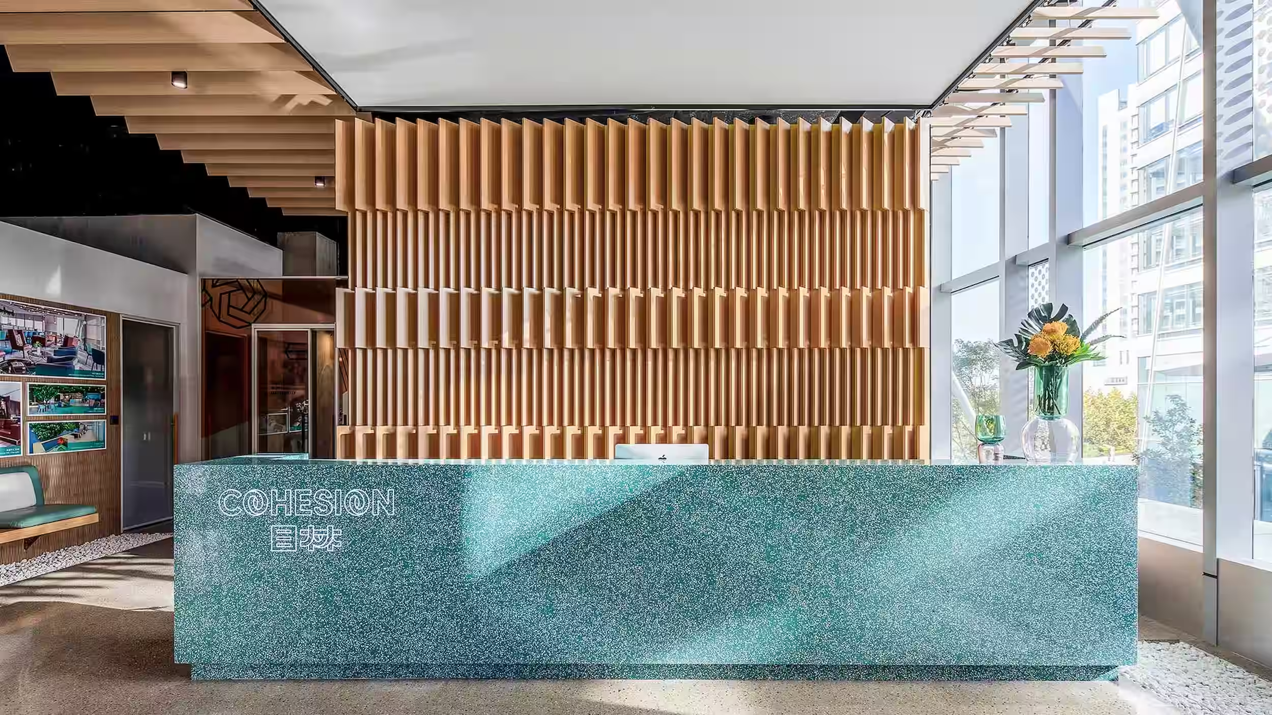
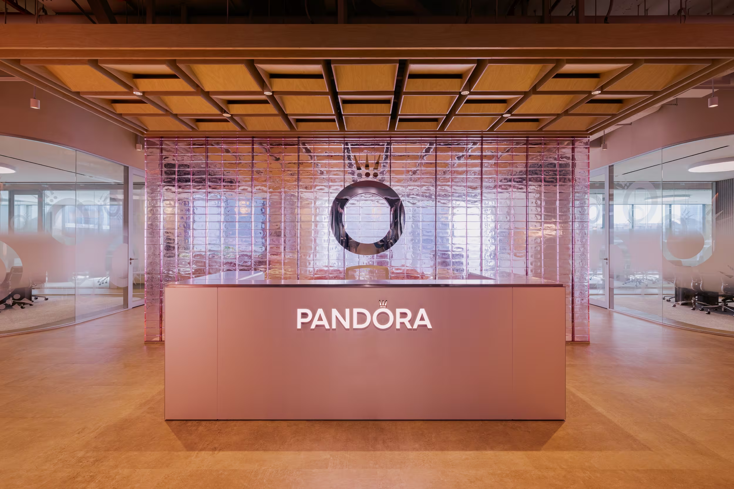
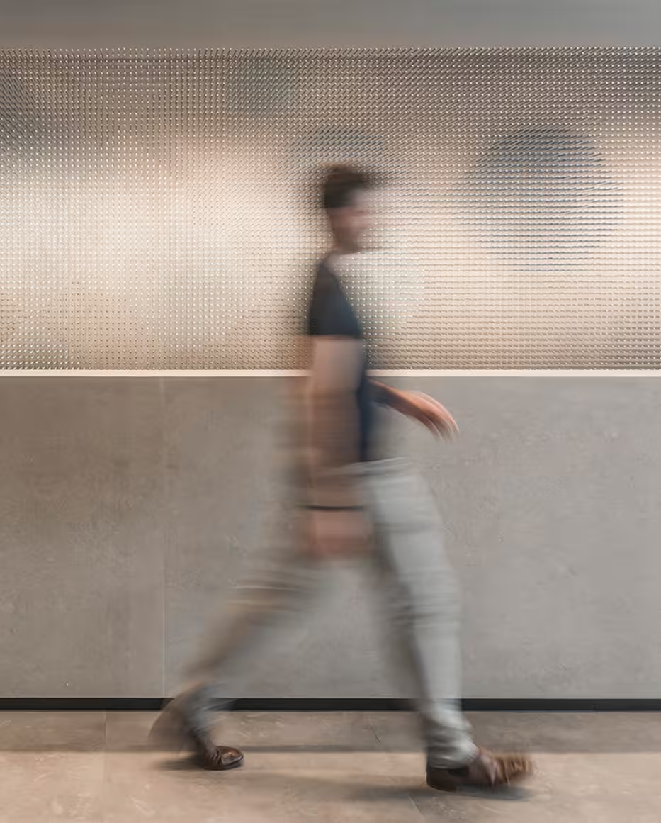
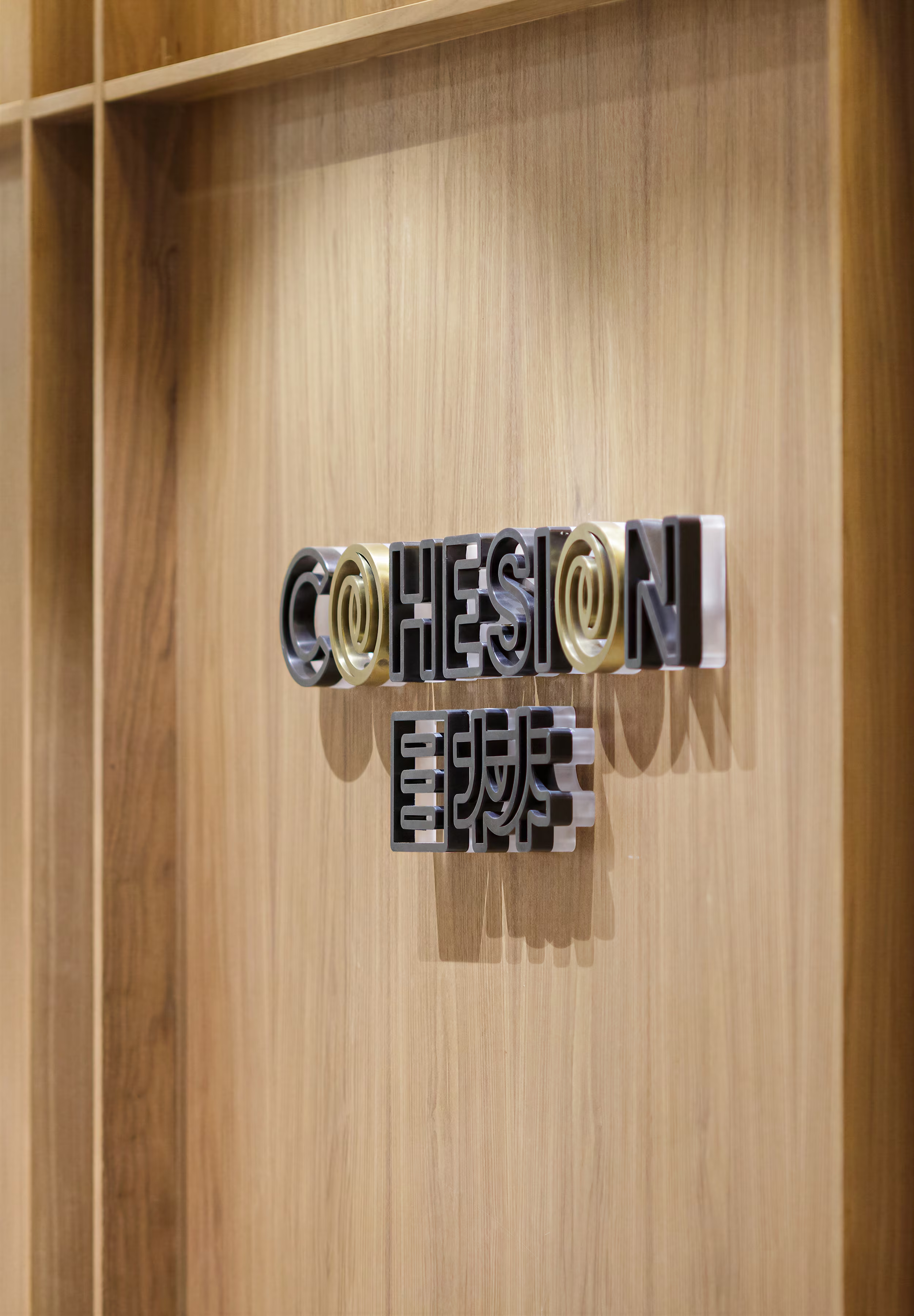
The bilingual Cohesion identity is integrated into the reception desk.
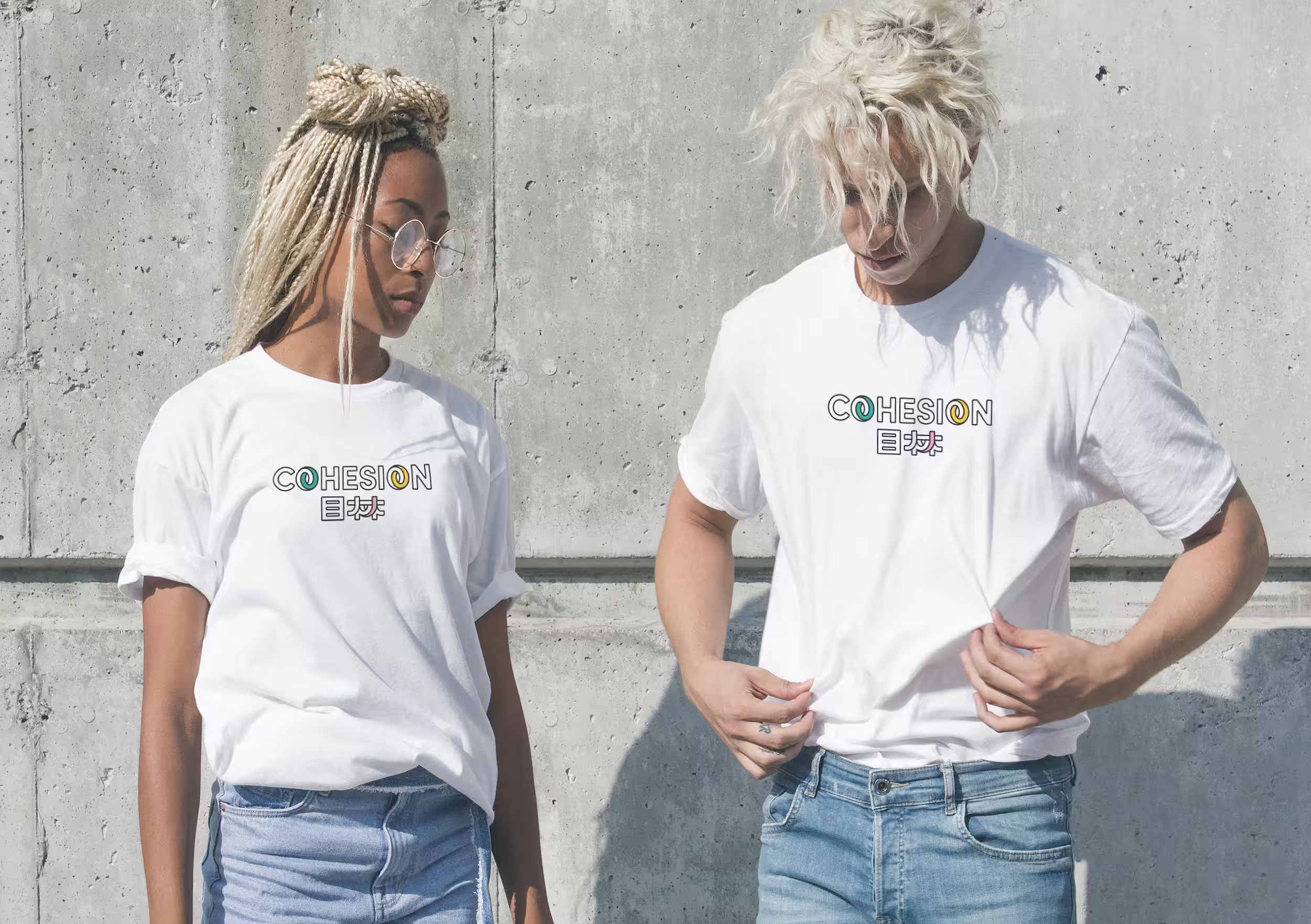
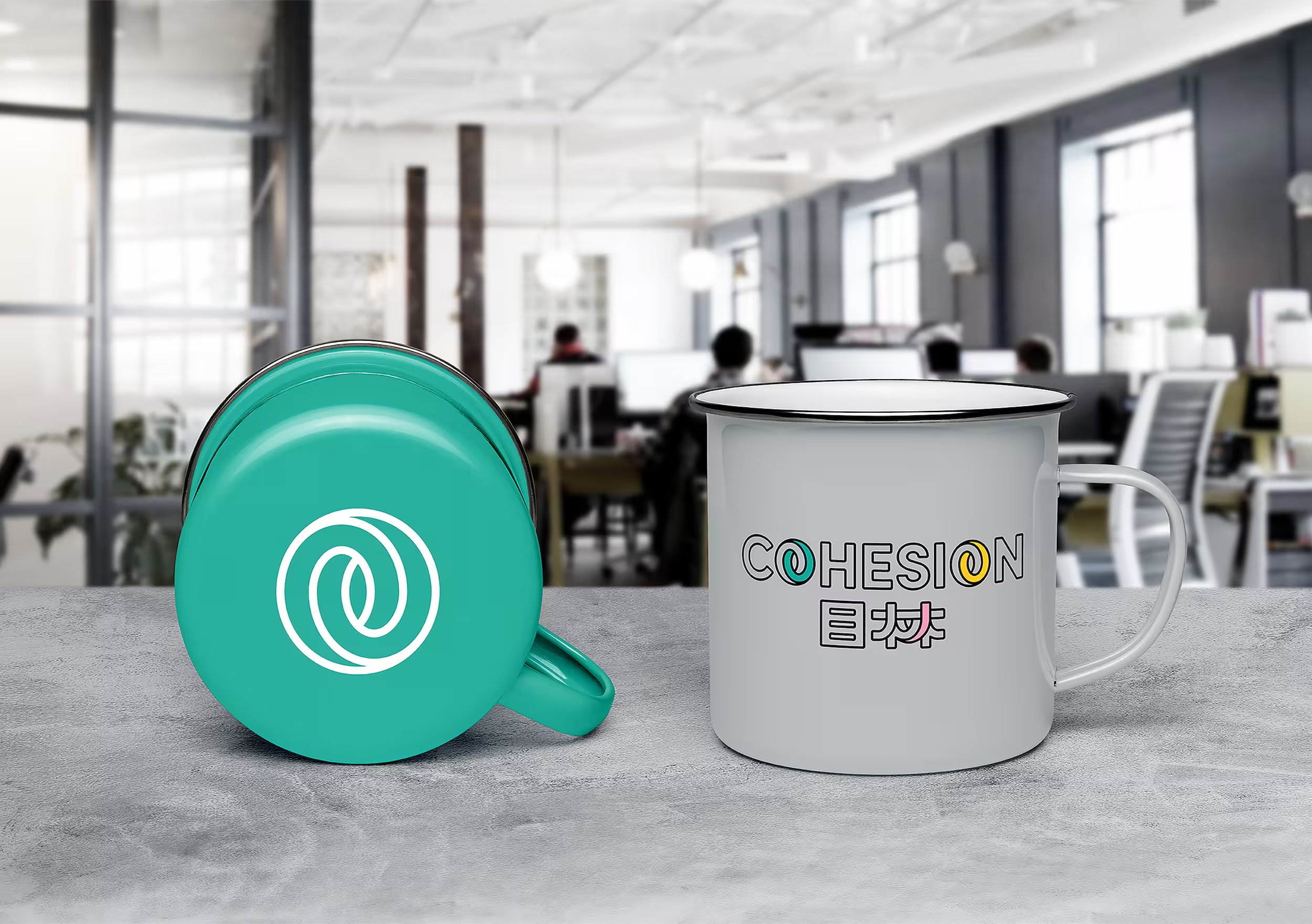
The bilingual identity extends across merchandise and branded touchpoints.
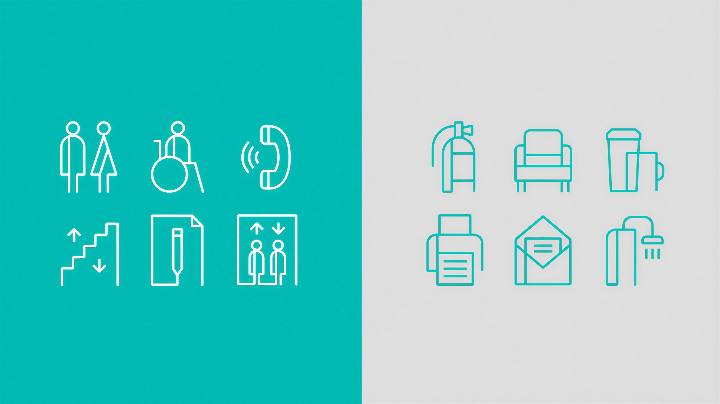
A custom icon system extends the visual identity across wayfinding and workplace touchpoints.
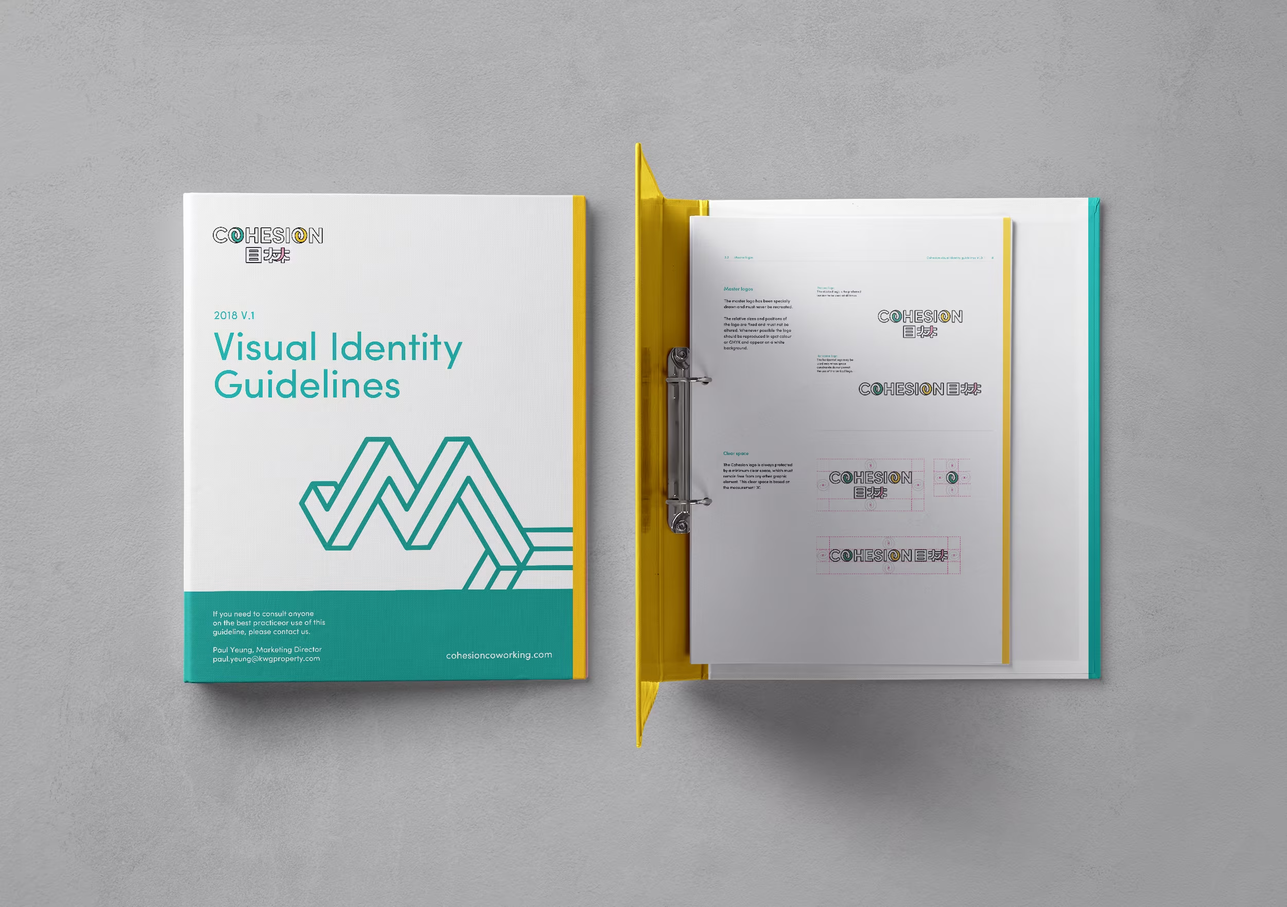
The visual identity guidelines provide a clear system for consistent application across all brand touchpoints.
A name is not a brand until it can travel. Cohesion was built so a new site could open looking exactly like the first.
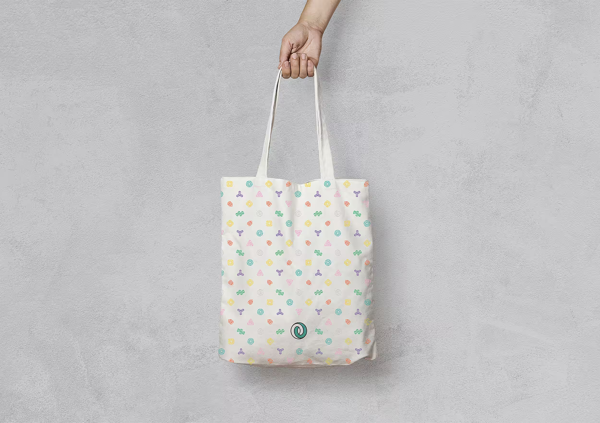
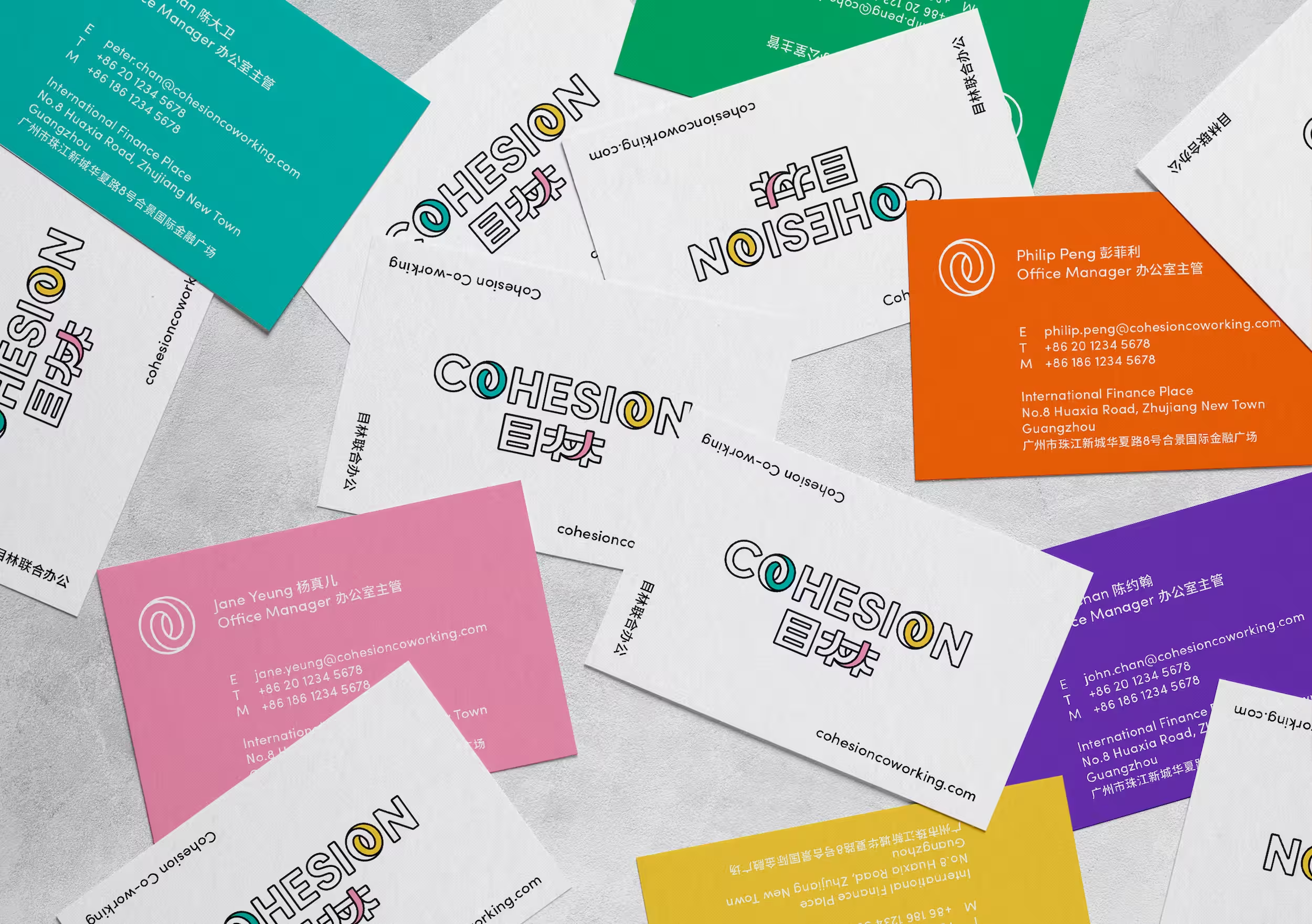
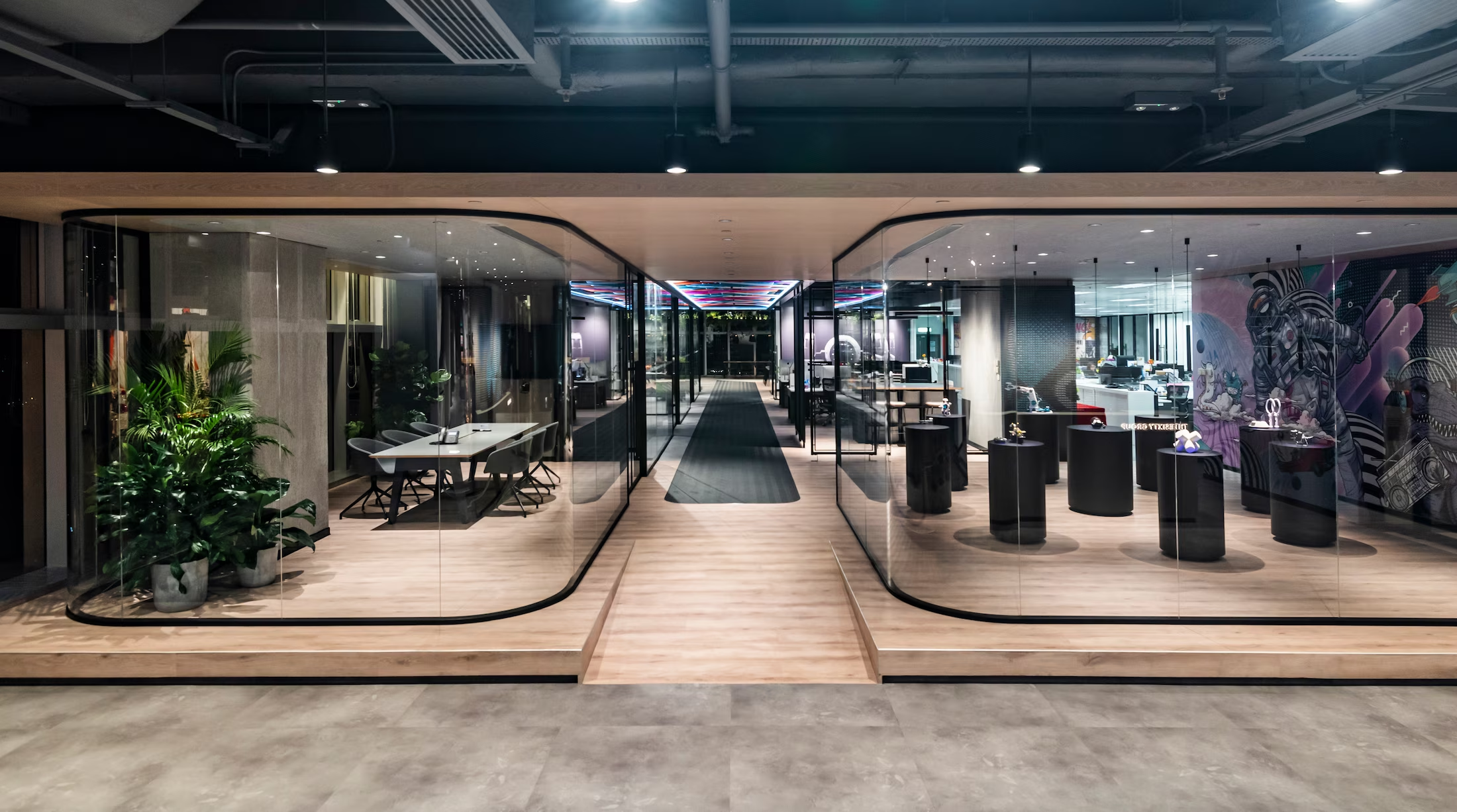
Selected views
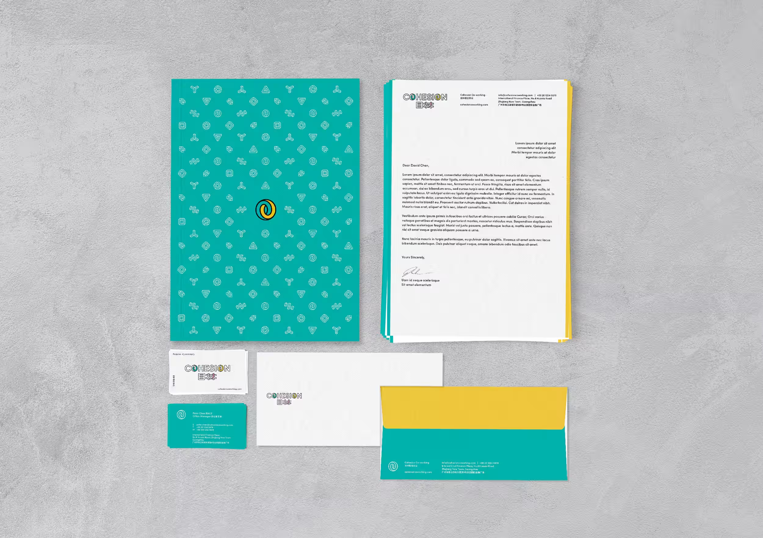
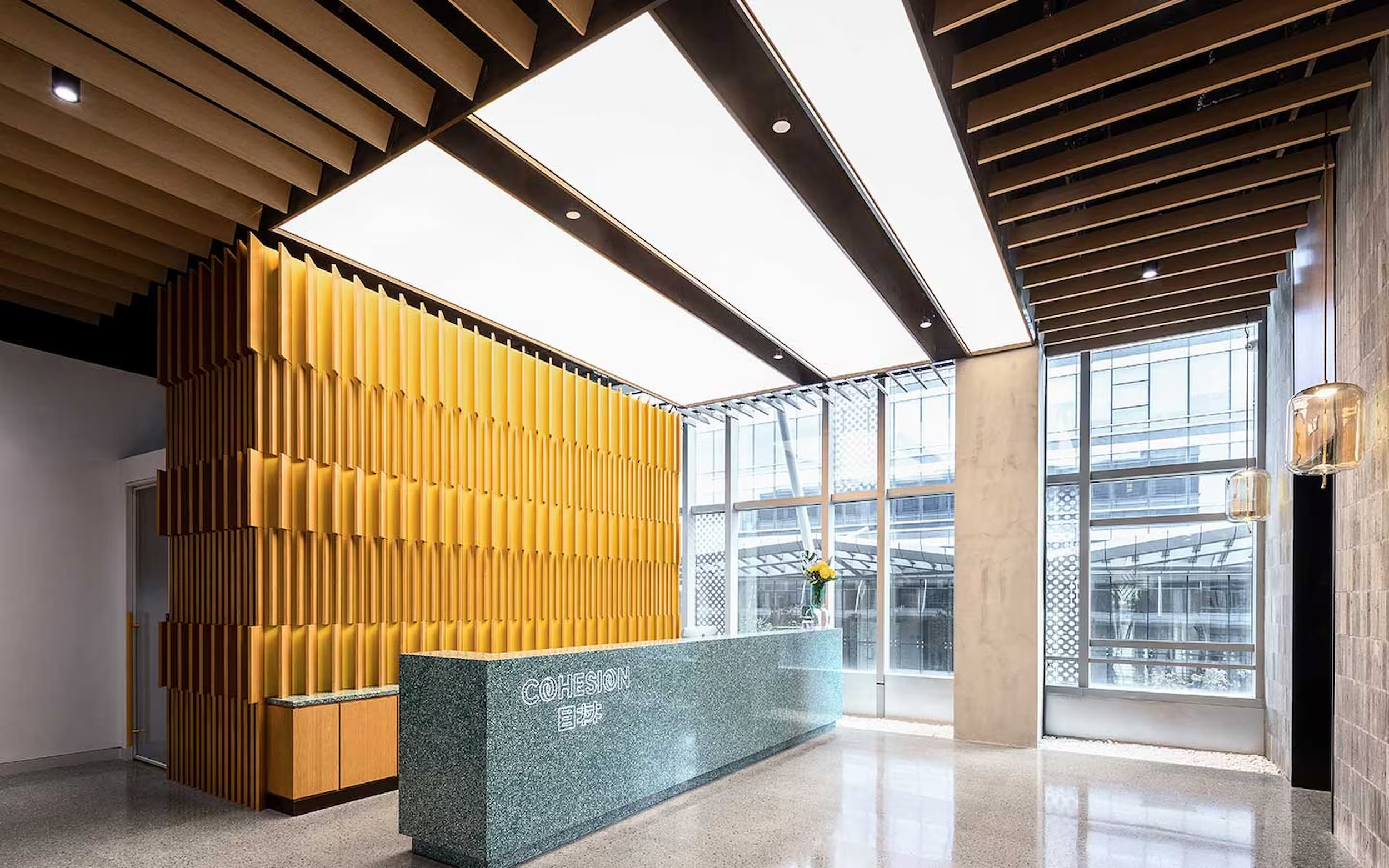
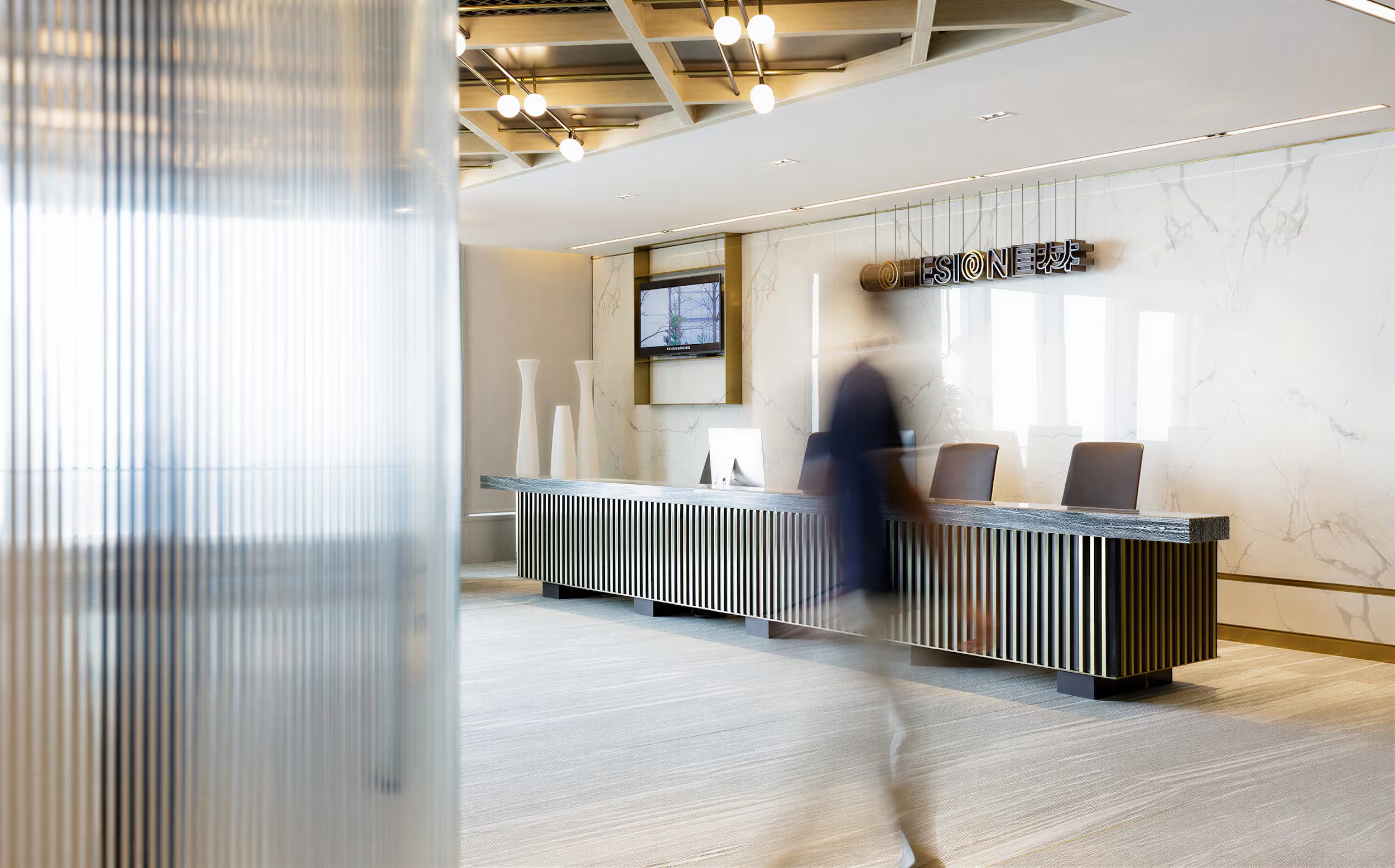
(Approach)An eye, and a forest. A name built on a philosophy of home, vision and growth.
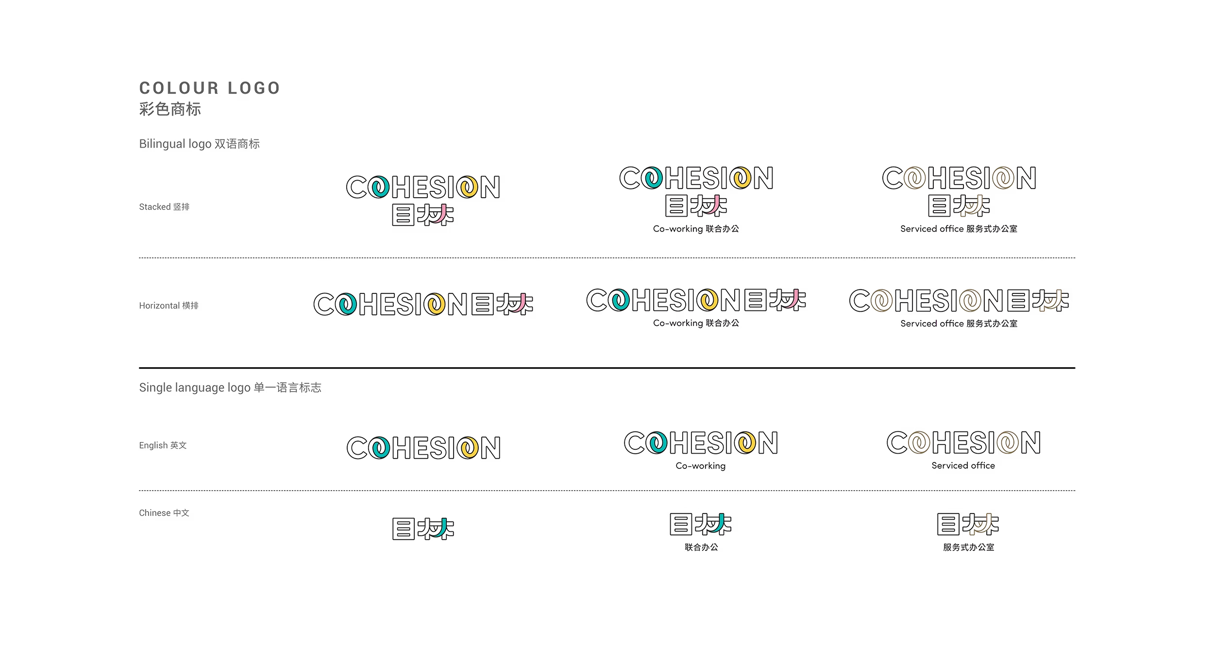
The flexible logo system adapts across bilingual, single-language and service-specific applications.
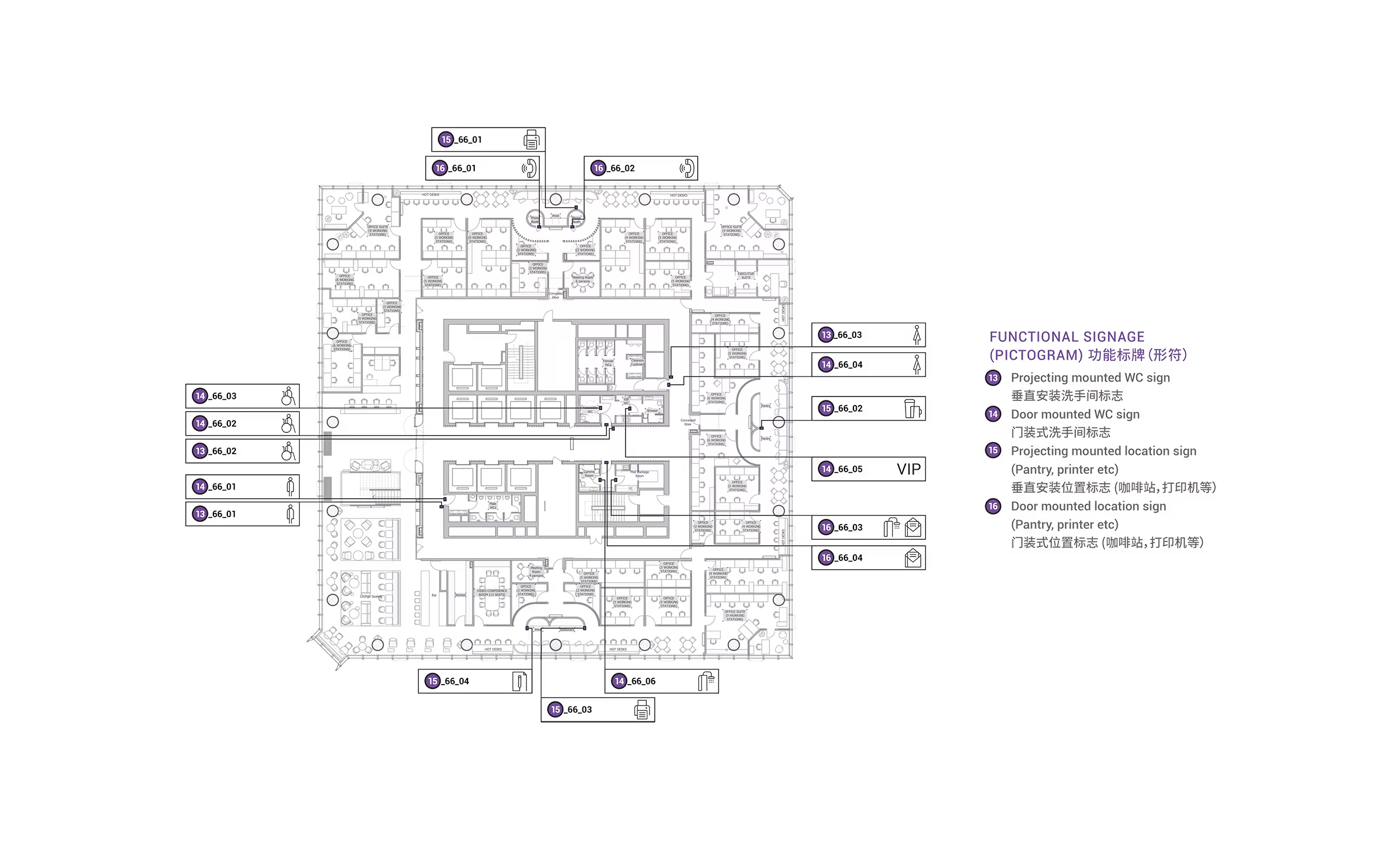
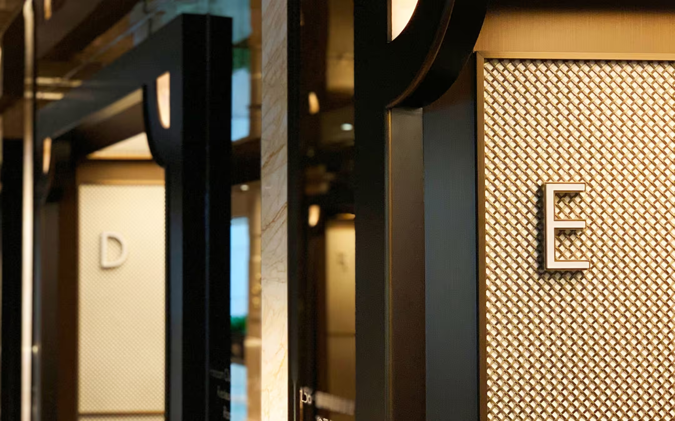
A coordinated signage and wayfinding system mapped across the workplace.
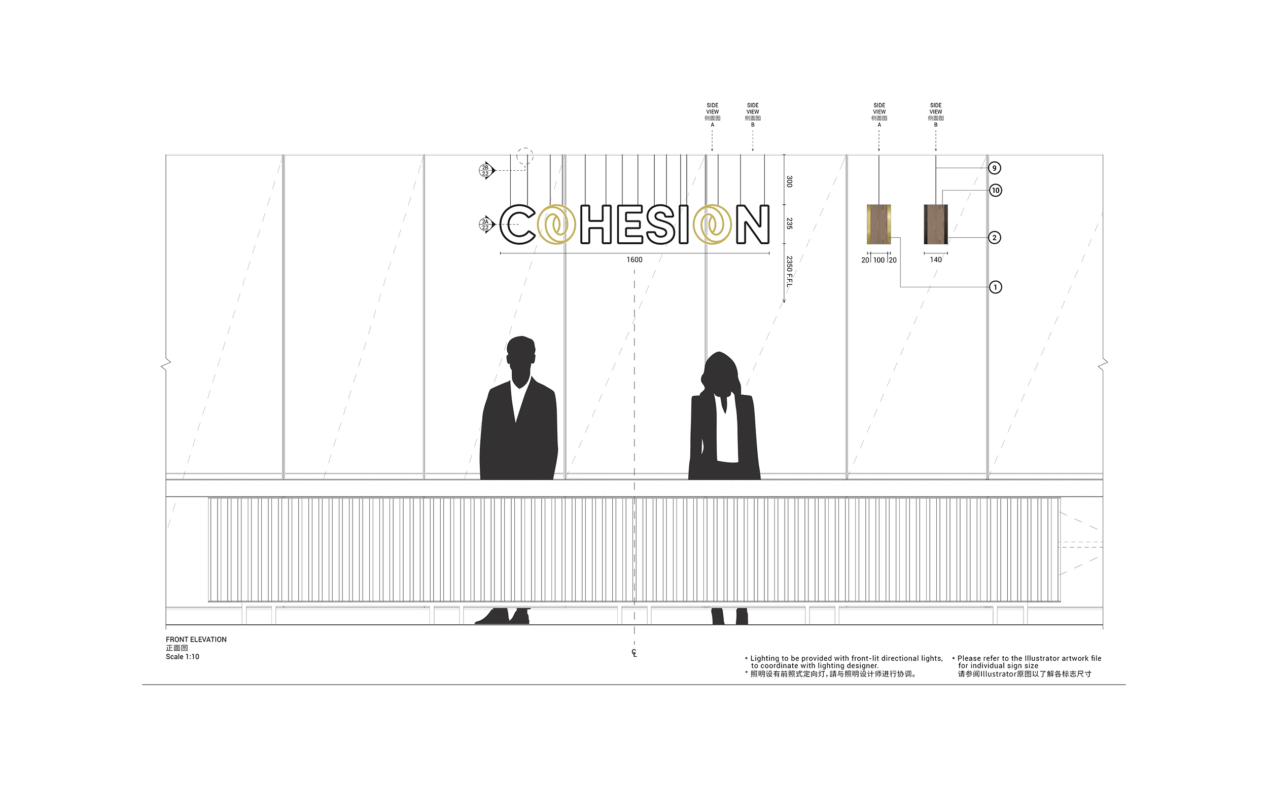
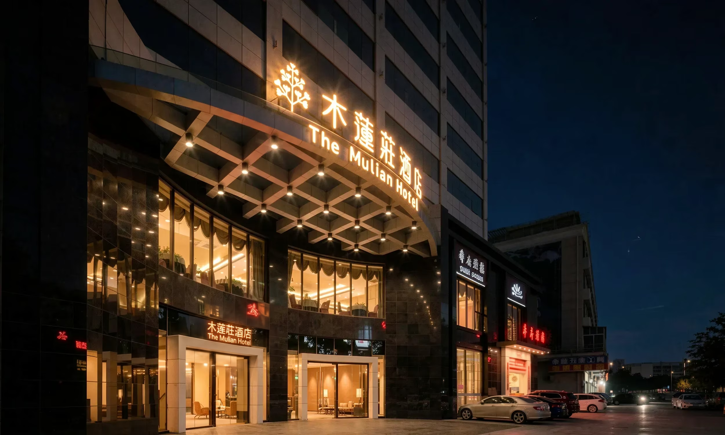
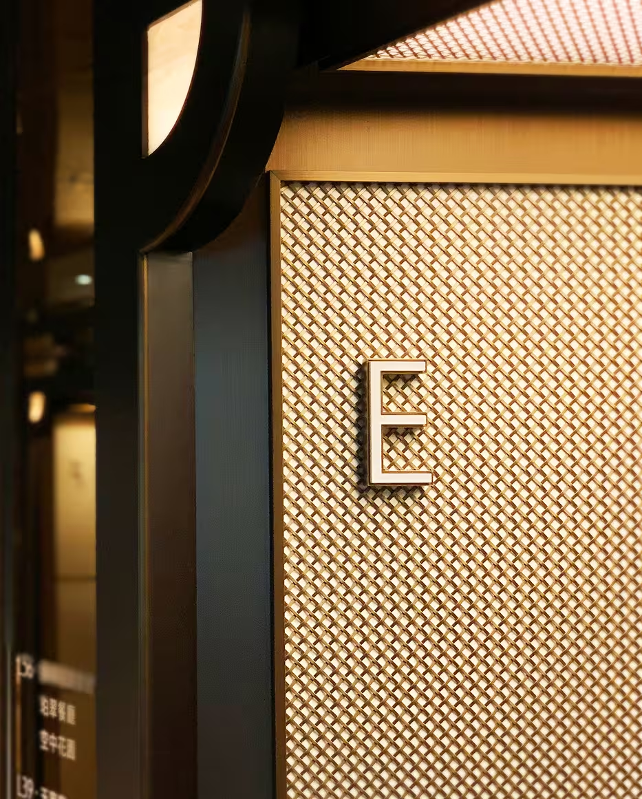
Detailed signage design translates the Cohesion identity into the built environment.
Up next